Color Schemer has been launched
on your Mac App Store
×
Subscribe for UpdatesWeekly Color Scheme Digest
Every Monday, get all the new schemes postedduring the previous week sent to your inbox.
New Course Content Announcements
Whenever a new section is added it to our course, you can be the first to know.
Company and Product Updates
Whenever something big happens, or new features launch, you can be the first to know.One-Time Alert: Windows Launch
As soon as the Windows version is ready, we'llsend you a one time email to get you started.
We respect your inbox as much as we respect a well-crafted color scheme. Your email is safe with us ‐ no third-party nonsense, no spam. Easily unsubscribe with one click, no hard feelings.
Color Schemer
Introduction to Color Theory
A Brief History of Color Theory:
The Color Wheel and Harmony
The Color Wheel and Harmony
Techniques for Creating
Harmonious Color Combinations
Harmonious Color Combinations
Is RYB and the Color Wheel
Wrong and Outdated?
Wrong and Outdated?
Color Models and Systems
Comparing RGB, HSL and CMYK: Strengths and Limitations
Color Management and Calibration Across Different Displays
Introduction to Modern
Color Systems and Models
Color Systems and Models
Advanced Color Theory
Going Beyond the Color Wheel: CIELAB and Advanced Color Models
Coming Soon
Monochromatic Color Schemes:
When and How to Apply
When and How to Apply
Coming Soon
Applying Perceptual Color Spaces
in Design with Color Schemer
in Design with Color Schemer
Coming Soon
Making Colors "Pop" with Chevreul’s Law of Simultaneous Contrast
Coming Soon
How to Mix Colors and
Create Beautiful Gradients
Create Beautiful Gradients
Coming Soon
Optimize Text Readability with
WCAG Contrast Analysis
WCAG Contrast Analysis
Applying for Digital Design
Creating Effective Color Palettes for Digital Design
Coming Soon
Color in Typography and Text Hierarchy
Coming Soon
Color Theory for Data Visualization Design
Coming Soon
Utilizing WCAG to Improve Text Readability and Contrast
Sufficient contrast ensures your content is easy to read, especially for users with visual impairments, color vision deficiencies, or simply those viewing your design in less-than-ideal lighting conditions.
Contrast is the difference in brightness between two elements, such as your text and its background. But how do you know when it's enough? Well, the WCAG guidelines define specific contrast ratio thresholds that serve as benchmarks for accessibility:
- - 4.5:1 for normal text (under 18pt or 14pt) bold).
- - 3:1 for large text (18pt and above or 14pt bold and above).
These ratios are calculated through the Luminance value of the CIE color space... and fortunately for you, tools like Color Schemer can do all the math for you.
Analyzing WCAG with Color Schemer
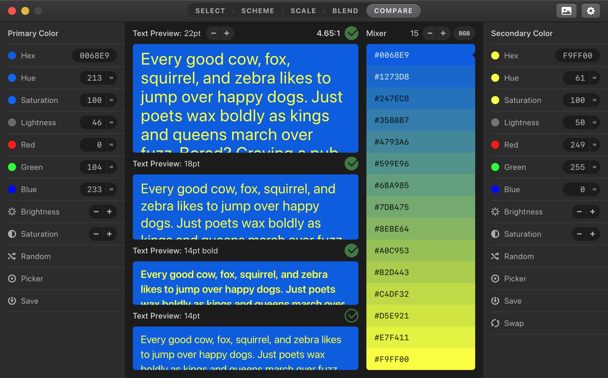
With Color Schemer, we can take the some of the guess work out of color selection and turn it into a science. Simply go into the "Mix" section of the app, and set a color on each of the columns. Then, you can evaluate the text contrast for different font sizes and weights, and tune the colors with ease.

As an added bonus, you can also mix the two colors through various color spaces, and get a spectrum of the color mixes.
Practical Tips for WCAG-Compliant Design
Think hierarchically. Use stronger contrasts for headlines and weaker ones for secondary text. This creates a natural hierarchy while maintaining accessibility.
Apply to icons and buttons.
If your button has white text on a bright red background, it likely lacks sufficient contrast. WCAG could be used to determine how much you need to darken the red to meet the minimum 4.5:1 ratio.
Avoid violent contrast. For example, when designing for dark mode, ensure that your “white” text isn’t pure white (#FFFFFF). A slightly muted white (#EAEAEA) paired with a black background provides better readability while reducing glare and eye strain.
Test across multiple devices and environments. Contrast isn’t static — it can vary based on the device or setting. A design that looks perfect on your fancy monitor might be hard to read on an older laptop or in bright sunlight.
Go beyond color. Add icons or patterns to highlight error messages instead of just using red text. Use underlines or bold styles for clickable links, not just a different color. This ensures that users with color vision deficiencies can still utilize your design.